Tanky Humanism
I showed this game to some other gamers this past weekend. It is always great to see the angles people take. As the coder, I already know where everything is, but someone who's never looked at it provides excellent UI/UX feedback!
I noticed two UI/UX issues:
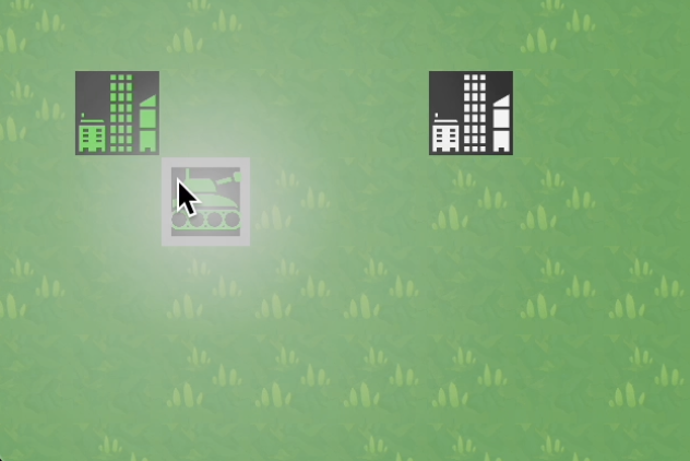
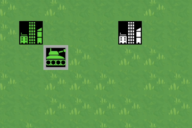
It was too difficult to see which unit was selected, especially when switching from one selected unit to another. To fix this, I added a giant circle with an alpha gradient focused on the newly-selected unit. It "flares" once for a newly-selected unit, then disappears, leaving the square "throbber" indicating the unit is still selected. Here are two pictures to demonstrate the sequence:


It was also jarring to have the unit selection jump randomly around the screen. To fix this, I changed the cursor to find the unit closest to the last selected unit. Now, when your eye or mouse was already on one unit, it's very likely the next unit will be close by, thus easier to see and select. Quality of life!
Files
tankies
Iterating to get to an ancient Mac game called "Strategic Conquest"
| Status | In development |
| Author | greenflysau |
| Genre | Strategy |
| Tags | html5--playable-in-browser |
| Languages | English |
More posts
- Boaty McBoatfaceJul 08, 2024
- stack-tasticJun 22, 2024
- Just fightersJun 16, 2024
- Tank FightersJun 13, 2024
- Tank MetropolisJun 03, 2024
- Tank SneakersMay 29, 2024
- Tank MarchMay 01, 2024
- Team RedApr 28, 2024
- New WorldMar 14, 2024
Leave a comment
Log in with itch.io to leave a comment.